The secret is a combination of 10 factors that attracts students & staff alike.
Look at your existing Atrium Space or your Proposed Atrium Space & visualise the following factors or use it as your checklist:

1) Natural Lighting:
The ‘Atrium’ is derived from the ancient Roman world. It was the main or central room of the house which often had an open roof to let the natural light in. Today we can imitate this open roof plan with skylights & small upper windows situated on the perimeter of the Atrium room. It saves energy & looks good. Natural light brings the outside in, adding a visual link with the outside environment.
2) Colours:
Colour, colour & colour! Colour makes your Atrium space attractive & inviting. Without effective coordination of colour you have a drab & useless Atrium. Make it colourful & classy. The Atrium colour scheme needs to be designed to encourage collaboration, bring students & staff out of their lecture/classrooms for small informal sessions of collaboration.
3) Open Plan:
An Atrium Space should give the building a feeling of ‘space & light’. The Atrium needs to be a space you feel small due to the enormity of the structure of the building while feeling secure in the internal enviornment. The ‘open plan’ should allow free collaboration in full view from the surrounding balconies of the building that overlook the Atrium space.
4) Furniture Styles:
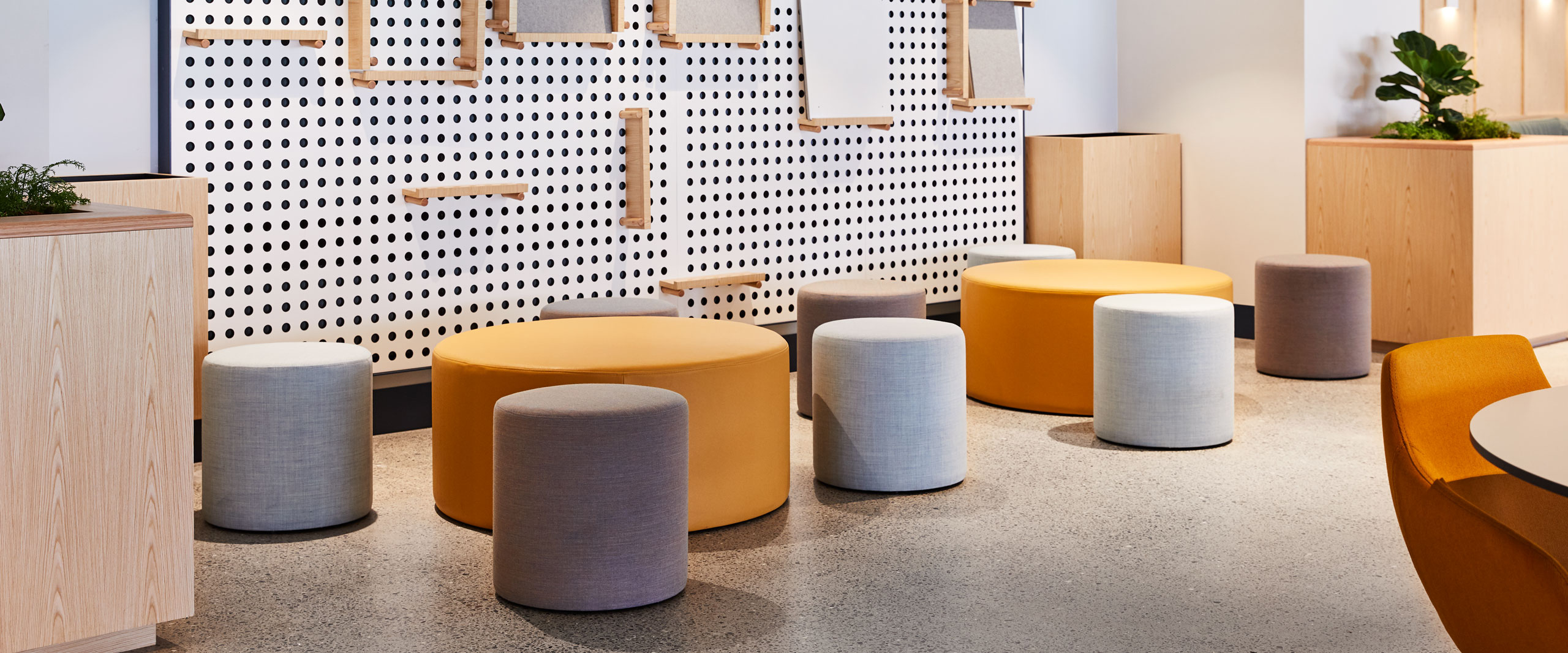
Modular is the go-to for Atrium Spaces. Curved, rounded, squared & comfortable. A free-form blend that attracts people to sit & lie on. Be generous in your furniture sizing; for example position 3 or 4 ottomans close to each other around a small table so that more than 1 person can share the space. Furniture also needs to be relative easy to move around. Should you hold a specail event in the Atrium space, rearranginbg of furniture would be necessary to accommodate the event. Ottomans on wheels, lightweight tables, fold-away chairs are all great ways to make the furniture ‘moveable’.
5) Furniture Layout:
It needs to be well-spaced so public people traffic is not an issue, while in close proximity so that small collaborative groups can be formed. The image below is a fine example of how this can be achieved.

6) Textures:
A clever blend of textures is a good choice. Texture belongs to the finishes you choose – on stairways, pedestrian bridges, walls, flooring & furniture. A great way to vary texture in furniture is to create a modular ottoman with a vinyl seat & a coordinating fabric back. This allows to hard-wearing on the seat yet the more visible back is an attractive display of patterned or coordinating fabric.
7) Maintenance:
The Atrium is a large space & will require regular maintenace to keep it looking up to scratch. Choosing flooring that is commercially rated & furniture that owns high levels of quality to ensure it looks as good as new year in, year out. Tip: Vinyl is a good choice for furniture items for its quick wipe-down feature & hard-waering qualities.
8) Wall/Acoustic Panels:
These need to be statement pieces. Either in a block colour or with unique cut-out shapes to make a statement on the large wall space available. Wall panels create depth & adds a 3-dimensional texture to the space. By using progressive panels you will imitate a cohesive design that flows easily & promotes attractive aesthetics.
9) Accessible & Amentities:
Accessible – ramps, stairways, doorways & lifts all need to be in close proximity to the Atrium space. Make the space a convenient place to get to & an enjoyable place to work in.
The proximity to amenities is important. No one wants to hang round in the Atrium Space if its a long walk to the toilets. In fact, in some Atrium spaces the only amentities are located near the Atrium space to encourage people to form collaborative groups in the open. Innovation starts in small groups & grows, its where the magic happens.
10) Secure & Safe:
Atrium Spaces are big spaces and as with most buildings it needs to meet building requirements of smoke control, fire resistance, emergency exits & minimising of obvious hazards. For example; glass railings would be avoided for the levels overlooking the Atrium due to the high risk of breakage & objects could fall through.
Signage: clear signage to amentities, exits & possible hazards.
For all the 10 points outlined above; collaboration is the main theme. If your Atrium space is planned upon encouraging collaboration, then you’ve got it RIGHT!
Informal meeting places for intellectual & social interaction is the way educational & commercial facilities are heading. Keep up with this emerging direction! Call 1800 228 877
Macquarie University have achieved this effortlessley with Civic Australia. Take a look at the finished project HERE.

We’d love to hear from you! Tell us how you created the right balance in your Atrium Space or how you propose to do this. Fill in our WEB FORM HERE.
Civic Australia
Freecall: 1800 228 877
Email: enquiries@civicaustralia.com.au
