At Civic Australia, we’re passionate about creating revolutionary spaces that inspire learning, encourage participation and enable collaboration. It was important that our website and branding supported our work.
As a company that is constantly making over spaces for its clients, it was time for a well overdue makeover for ourselves.
Why rebrand?
Civic Australia last rebranded in 2015, however, very quickly the logo and brand was tired and outdated. As we changed direction to serve only the education sector, our branding fell behind and didn’t truly represent who we are as a company.
Since 2015 our team has also expanded, going from 60 employees to nearly 100. During this time, our processes also become more streamlined as we knew what our clients needed and how we could deliver them.
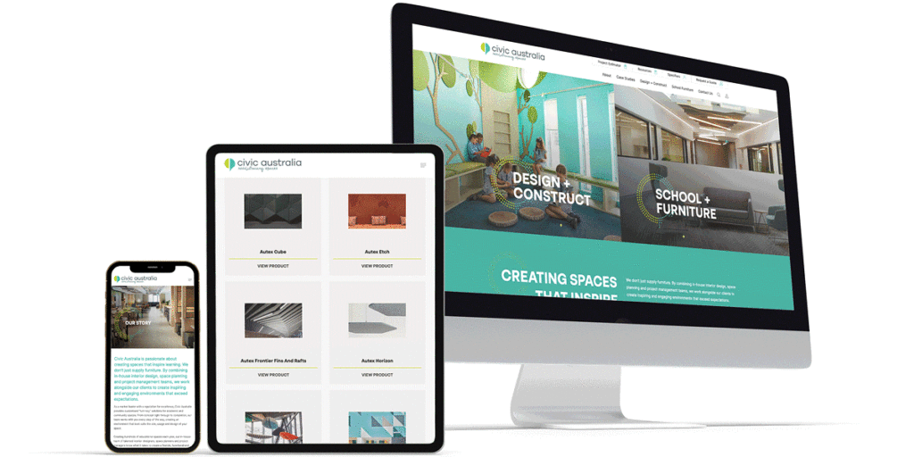
The new website
It’s no secret that the internet moves fast. Each week there’s something new to discover and a new way to harness the power of technology. Built in 2015, our previous website simply wasn’t up to speed and didn’t convey the service we were providing to our clients.
The new and improved Civic Australia website now displays our Design + Construct offering, a no brainer for schools looking to do refurbishment. This offering sees our interior designers and project managers come together to create state-of-the-art learning spaces.
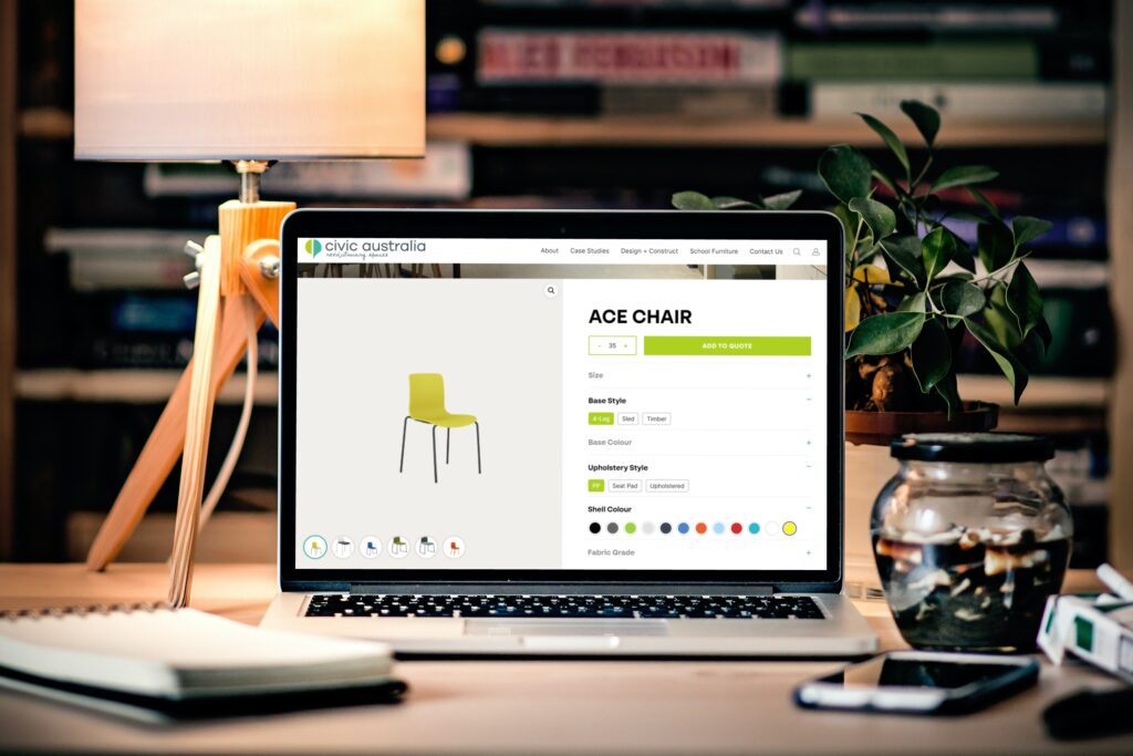
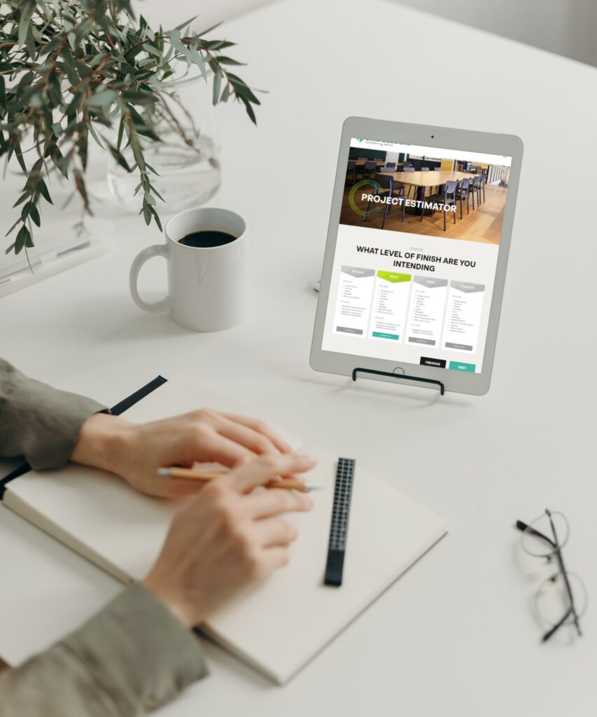
As for our furniture range, our website now shows everything available. Look through over 550 products and see every customisation option available. Discovering pricing is also easier than ever with our new project estimator which allows you to get an estimate of a refurbishment within an existing space.
The tagline
Our new tagline, Revolutionary Spaces, has been brought in to sum up our mission and purpose. We’re committed to pushing boundaries in education design whilst ensuring that they remain practical and fit for purpose for both students and staff.
A specifiers dream
For the specifiers, we’ve created a portal which allows you to create an account, login and get access to technical drawings which you can download free of charge to insert into any project you are working on. Clear visibility on product options also makes it easier to visualise products in your space.
The new logo
What was the inspiration behind the new Civic Australia logo?
The team wanted to create a shape which would represent teachers and specifiers whilst remaining corporate so to continue appealing to executives, managers and principals. After several rounds of revising designs, we found the even mix of both a fun and exciting approach yet professional.
Want a peek at the creative process? Here is some of the brainstorming behind our new logo:
– Shapes depict thoughtful, precise solutions and growth
– The left half represents our core furniture range offering hence a standard shape and the right half depicting our Design + Construct offering as represented in the custom designed shape.
– Customised solutions personalized to fit each client and project uniquely working harmoniously with our popular and standard products.
Our mission moving forward
Our mission, people, culture and service still remains the same despite the new look. We’re moving forward with a refreshed purpose and vision for education spaces, working to change the way Australians think about learning.
We want studentsand staff to feel inspired every dayby creating custom learning spaces that meet their growing needs and give their imaginations room to run wild.


